Configure Chart in Analytics report
The Chart view helps to highlight different perspectives of data. The Chart view supplements the Grid view. Charts are based on the selection of data prepared in the Grid view.
There are some Chart representations: the Bar representation, the Line representation, the Pie representation, and the Radar representation. All of the representations of the Charts show the same data. However, each representation looks differently and showcases different perspectives of the same data.
To create a Chart, it is possible to use different approaches when it comes to what to think about first, and what to tackle next. The approach below is exemplary, an average flow of actions to take when creating a chart. It is based on standard use cases. The real life tasks can require different methods. If needed, please, consider an opportunity to ask questions to the ObserveID Engineering Team.
Create a Chart
Creating a chart has the prerequisite of a defined dataset. First, it is achieved by selecting a report type from the New report popup available on the report creation. The type helps to determine the key entity for the report whether it about identities, or accounts, roles, resources, entitlements, etc. The second step is to narrow down data and refine until the dataset is fully aligned with the purpose of the representation.
To prepare a dataset, click Configure in the report and go to the Data and Filters section. For more details about how to configure data in the Grid, see: Configure Grid in Analytics report
Having the data ready, start creating a Chart as follows:
-
Go to: Chart Options.
It will show a diagram already built from default dimensions and the prepared data. Regardless of the existence of the chart, it needs to be adjusted according to the purpose of the report and the chart.
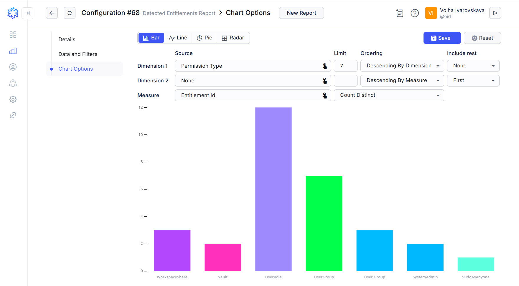 Default dimensions in the Chart view
 -
Build a question in the format:
”How many <something> are made per every <something>? or
”How many <something> are included into <something>?”
For instance,
-
how many sessions are made per each account type out of the following account types: user, privileged, firecall, and service? - so that to know what the most popular account type for the last three month; or
-
how many sessions are made per every client email? - so that to know who were the three most active users in your corporate infrastructure for the last three months; or
-
how many roles provision entitlements from a specific integration? - so that to know the most popular role access among employees.
The question helps to formulate the purpose of the chart so that exactly to know what Chart should visualize.
-
-
Set Dimension 1. It is the second <something>. It is the key subject. It is the horizontal x-axis in the coordinate system. The x-axis grows to the right-hand side.
-
Set Measure. It is the first <something>. It is the item of count. It is the vertical y-axis in the coordinate system. The y-axis grows upwards.
 Re-defined dimension and measure from the default ones
 Also, the Measure requires Aggregation to be established. Because the Measure determines what data to populate on the y-axis, its Aggregation would allow you more precisely to select specific values from the selected data. For example, if a Host Name is selected as a Measure, then by establishing the
Count nullas its aggregation, it is possible to show only those records that would have no host name detected. And by establishing theCount Distinctas an Aggregation value, it is possible to count records with unique Host Names. -
Determine Limit. It establishes the quantity of points to show on the x-axis.
-
Select Ordering. It places the points of the x-axis:
-
either in the alphabetical/numerical order of the direct points on the x-axis (i.e. the Dimension);
-
or in the alphabetical/numerical order of the amount of the y-axis points counted for every x-axis point (i.e. the Measure).
-
-
If needed, set Include rest. It adds the rest of the data as one more point to the established Limit.
If
First, orLastis selected as an option, then the rest of data will be displayed respectively, as the first point before the Limit points, or as the last point after the Limit points on the respective axis in the coordinate system. TheFollow Sortingoption will make the rest of data point to be factored in the established Ordering, and respectively, the point for the rest of data will be placed among other Limit points. TheNoneoption removes the Include rest from the Chart. -
Click Save.
With all of the above identified and established, the Chart is built, and ready for use or analysis.
Selecting Sources for Dimensions/Measure
The Integration Data and Access Detection accumulated from various targets represent vast volumes of diverse information. For example, it can be time, or names, or IP addresses, or true/false values, or years, etc. When a specific parameter is selected as a source for the points to be displayed on the coordinate system, it is important to understand the meaning of the data, to be able to read the Chart representation correctly.
Example 1: if to consider the Grid view, when the Permission Type parameter is selected as a Filter option in the Detected Entitlements type of report, then the row of data would appear in the Grid in case if the entitlement is assigned and its permission type would be in line with the established permission type condition.
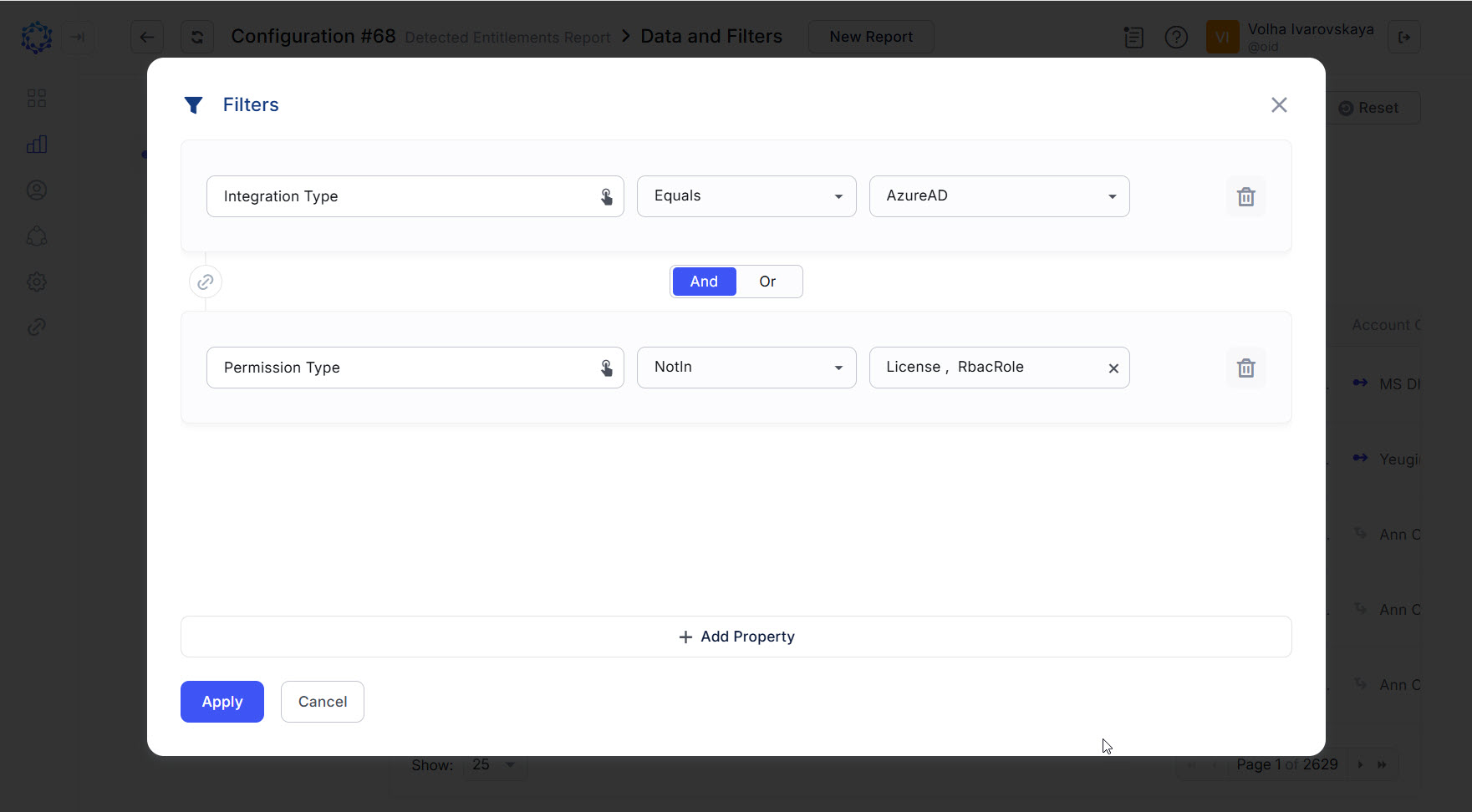 Setup of filters in the Grid to define the dataset to use in the Chart
Example 2: if to consider the same but in the Bar representation, when the Permission Type parameter is selected as a Source for the x-axis points, then the points of one specific permission type would be projected on the x-axis; and the quantities of identities who have accounts with entitlements meeting the permission type, define via the Filters in the Grid, would form vertical bars standing along.
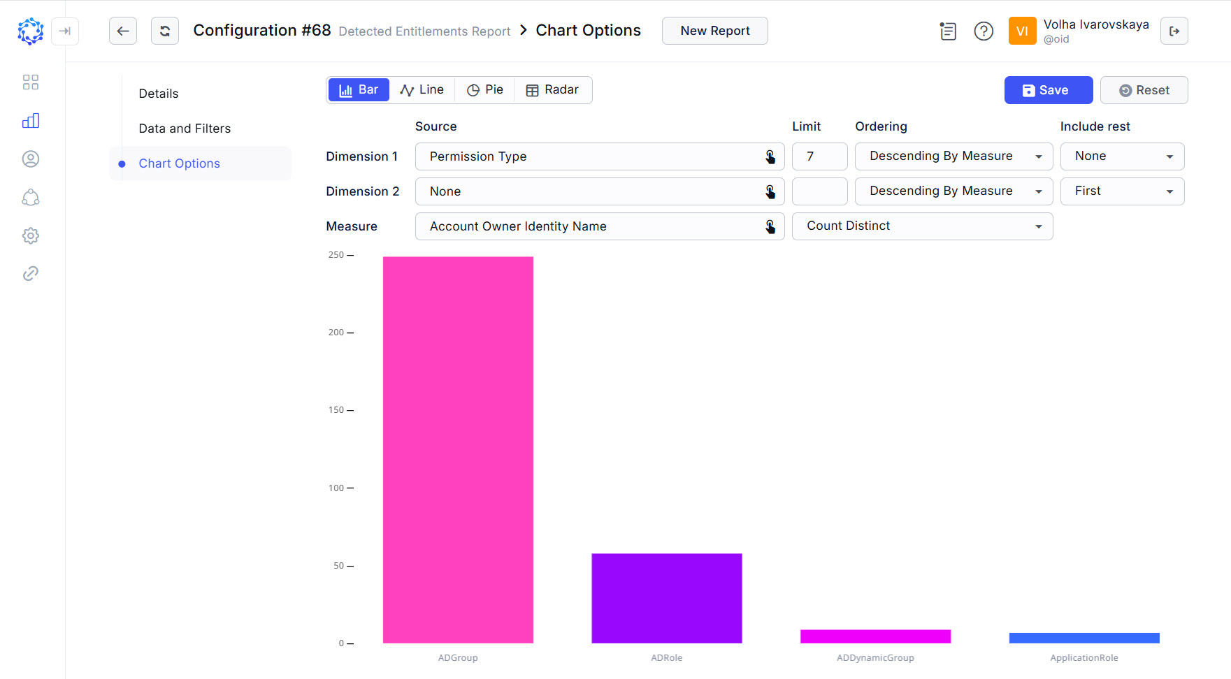 Chart showing quantities of identities with accounts having the entitlements of the specified permission types
Use Cases
Use Case 1 - what are the most popular Integrations, i.e. have the highest number of visitors?
To implement this use case, select Integration Type for Dimension 1. The Integration Type parameter determines all integrations that have the selected Integration Type. And select IP Addresses for the Measure. It will determine visitors, assuming that one visitor uses one IP Address. The amount of IP Addresses per Integration Type for the given period will tell us what would be the most popular Integration Type.
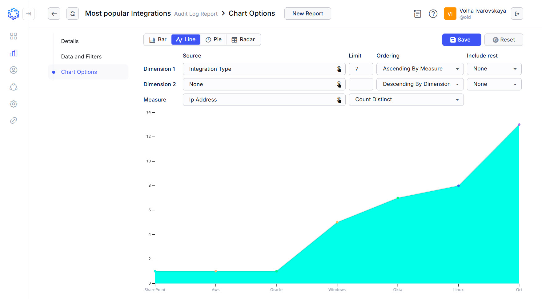 Most popular integrations for the last day by number of visitors
Use Case 2 - which year was the highest load on AWS resources?
If in the Grid to select Access Detection data for the AWS integration only, and then in the Chart to establish years for Dimension 1, and then to count session IDs for each yesr, then the greatest amount of session IDs in one year would tell us that this year would be the most active, as during this year the system detected the highest number of sessions.
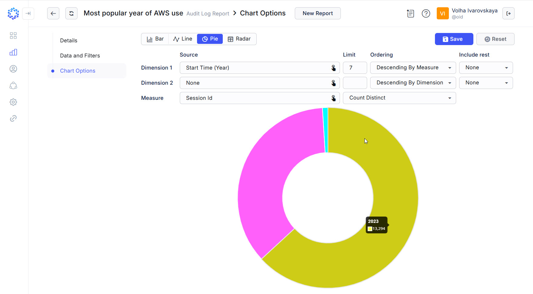 Highest load per year
Adding Dimension 2
Dimension 2 is the z-axis, an optional parameter, that if selected, makes up the three-dimensional coordinate system. On the two-dimensional Chart, to show the third dimension, the x-axis combines both representations of the x-axis itself and the z-axis overlaid one by another. It allows the analyst to create meaningful diagrams with multiple perspectives.
If to take Use Case 2 and add the third axis to it, which is pictured on the Bar representation below, it would be possible to determine what was the most popular account type with which the users logged in to the AWS target in each year.
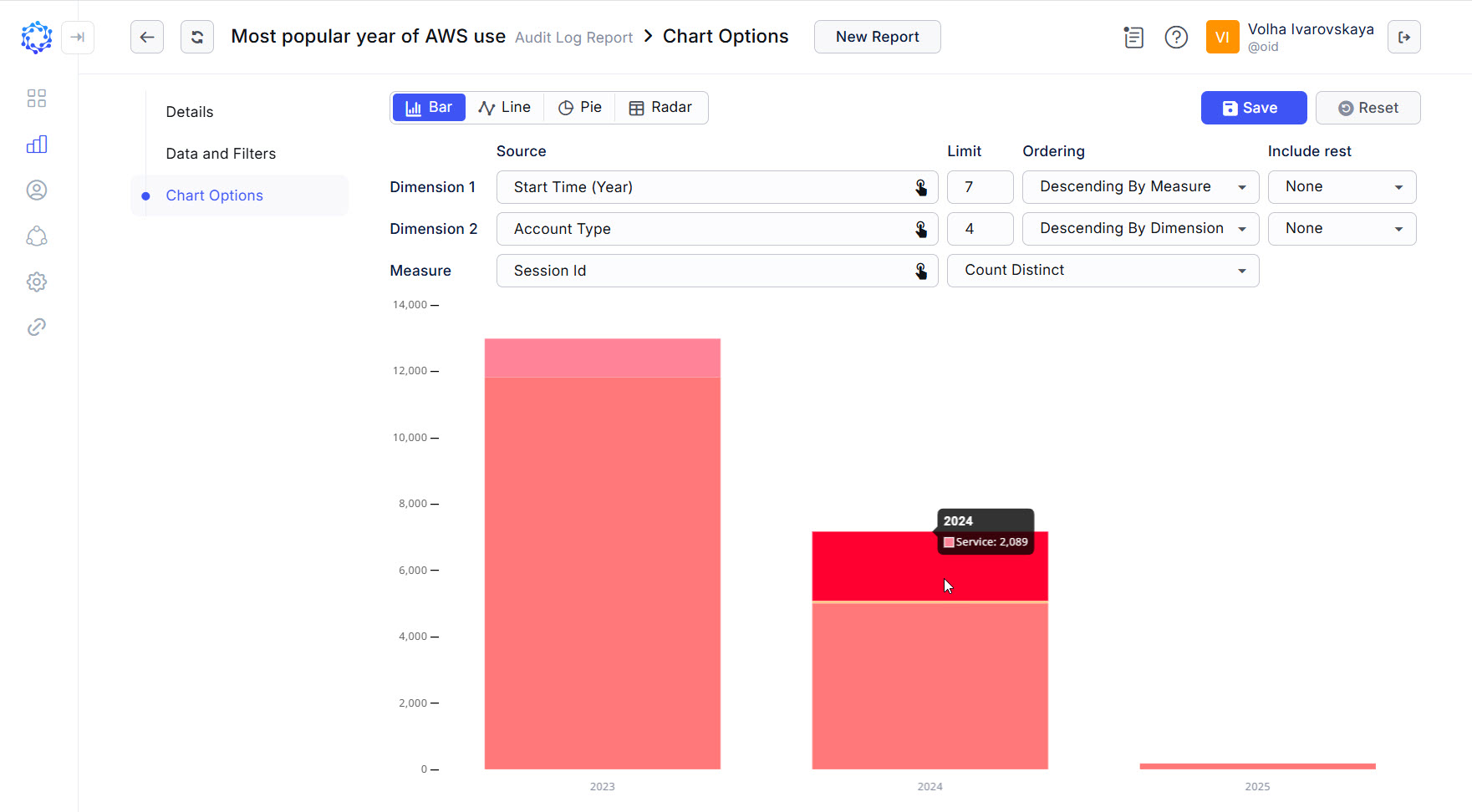 Activity per year by Account Type
